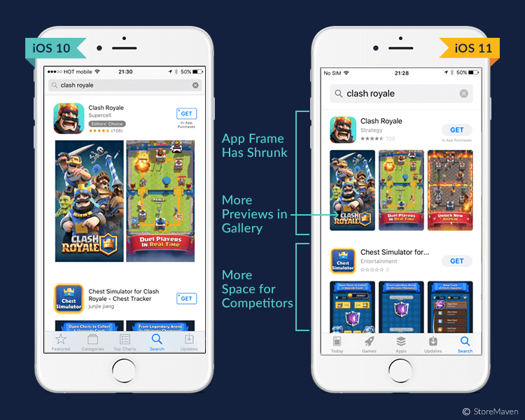
More discoverable, more intelligible and beautifully redesigned; these are the words that will jump right into your head when you start navigating Apple new IOS11 App Store!
“Now, we are taking everything we’ve learned from the App Store over the past nine years and putting it into a stunning new design. Every element of the new App Store is richer, more beautiful and more engaging.” – Philip Schiller Apple’s senior vice president of Worldwide Marketing.
Such changes are highly affecting apps’ rates of discoverability, engagement, and downloads. And as an app developer or a mobile marketer, you need to get ready to restructure your whole ASO strategy accordingly. So, let’s dig deeper into these revamps?
TODAY
Remember the old “Featured” tab? It’s now replaced with a very advanced tab, and it’s now called “Today”! Today is a unique feature where users can daily view the latest apps and news in their IOS11 app store. So, every morning when you check your store, you will find the app of the day, the game of the day, the news of the day, etc. there will also be a wide range of stories shared by developers from all over the words. Such a tab has raised the bar too high; it’s not easy to get featured in the today’s tab, but when you do, it will be one of the most powerful booster tool ever made for your app.
APPS AND GAMES
The old days where apps and games were all stuffed in the same place is gone! The new IOS11 app store is categorizing both now, which reflects a great understanding of how different they are and how much better it is to separate them. This separation thing is giving developers their own space to work specifically and thoroughly on the marketing of both and presenting an easier tool for users to reach their purchasing destination with the minimum effort.
PRODUCT PAGE
Now, this is a whole new story with lots of details that can benefit you the most! So let’s take it one by one:
1- App Name
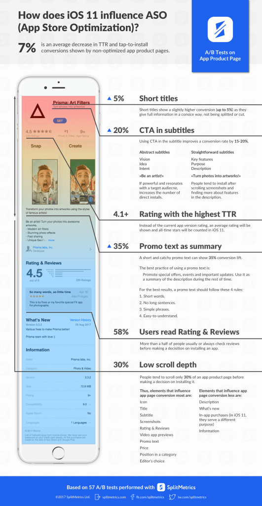
Your app name is now shortened to be only 30 characters instead of 50, a problem? Not at all. iOS11 is now giving you a chance to skip all the long boring app names and encourages you to grape your purchasers’’ attention with a short, attractive and sample names
[perfectpullquote align=”full” bordertop=”false” cite=”” link=”” color=”” class=”” size=””]Apple tip for you: “Choose a simple, memorable name that is easy to spell and hints at what your app does. Be distinctive. Avoid names that use generic terms or are too similar to existing app names.”[/perfectpullquote]
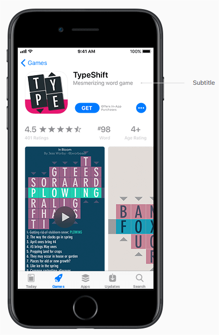
2- App Subtitle
The same thing is applied to your app subtitle.
It’s a new additional bonus from Apple, where you are offered an extra 30 characters in the form of a short subtitle that appears right below your app name.
It’s your extra chance to tell more about your app; and here is where you should include your CTA and your app’s added-value.
But watch out, you can only change your subtitle with an update.
[perfectpullquote align=”full” bordertop=”false” cite=”” link=”” color=”” class=”” size=””]Apple tip for you: “Avoid generic descriptions such as “world’s best app.” Instead, consider using your subtitle to highlight features or typical uses of your app that resonate with your audience.”[/perfectpullquote]
3- App Promotional Text
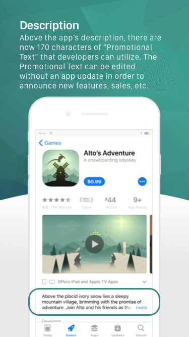
More promo characters to use, a 170-character promotional text to describe your app and will appear on the top of your description area.
This promotional text is an extra way to highlight the most important aspects of your app.
In that particular feature, there are no watch-outs.
You can change your promotional text with no need to re-update your app.
But the pair in mind that this text will not be part of your ranks-higher strategy in the app store search.
[perfectpullquote align=”full” bordertop=”false” cite=”” link=”” color=”” class=”” size=””]Apple tip for you: “Consider using promotional text to share the latest news about your apps, such as limited-time sales, upcoming features or content, or other events within your app.”[/perfectpullquote]
4- App Previews – Videos and Screenshots
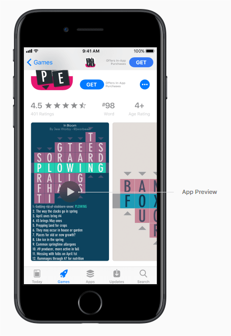
More bounces from iOS11, a very attractive gift that consists of three video app previews and five screenshots for previewing your app, what a gift!
Now you do not just have title, subtitle and a written description, you also have these to make empower your app.
Each video of these can last for 30 seconds, and it will be localized according to the country your user is viewing the video from.
Another watch out in here these app preview videos will be auto-played with muted audios when a user enters your product page, which means that your first few seconds of the preview need to be the most captivating and attractive one for users to open and download.
What will happen if there are no video previews? Your screenshots will jump in, where the first one to three images will appear in the search results
[perfectpullquote align=”full” bordertop=”false” cite=”” link=”” color=”” class=”” size=””]Apple tip for you: “Think about using your first app preview to show an overview of the app experience, focusing on the app’s core features and content.
Aim to tell a cohesive story that gives users a sense of the journey they will experience when using your app.
Then create a second or third preview to highlight additional features or specific content that users might not know about.
Make sure that each video shows users something new about your app.”[/perfectpullquote]
5- App Rating and Reviews
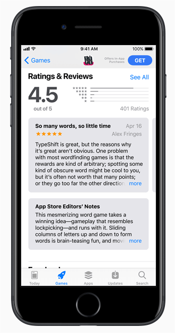
Forget all the low rating you once worried about. Now IOS11 is only displaying the overall rate of your app.
Not just that, you can also reset that average rating whenever you want. Which means that you can delete the old unpleasant rates when it exists, for your app to convey the ongoing quality only.
Regarding the reviews, you can promote the reviews’ requests for your app up to 3 times per year.
So, you need to restructure your new strategy to get the max out of such some limited promotions.
[perfectpullquote align=”full” bordertop=”false” cite=”” link=”” color=”” class=”” size=””]Apple tip for you: “ask users to rate and review your app at appropriate times throughout the user experience. Make the request when users are most likely to feel satisfied with your apps, such as when they’ve completed an action, level, or task.”[/perfectpullquote]
One last watch-out tip for apps that haven’t been updated for so long: Apple is no longer supporting 32-bit
summary
Lots of exciting changes and gifts to utilize, lots of attractive features to use, and surely Apple will not stop. So what should you do now regarding ASO new strategy? We got one advice for you….
“USE. YOUR. CONTENT. WISELY.”
It’s all about content. If your description, app name, promotion videos/screenshots, etc.
didn’t attract your user’s attention in the very first 10 seconds, then you are wasting all these gifts IOS11 app store is offering to you.
Remember that, less is more. This is the real trick in here.
Still, got questions? Do not hesitate to reach out and Contact Us! Request Demo now.
